NNS dapp - UI design upgrade and public proposals

Hey :wave:

NNS dapp got another design iteration (:man_artist:) and the proposal content is now public (:rocket:).


Design

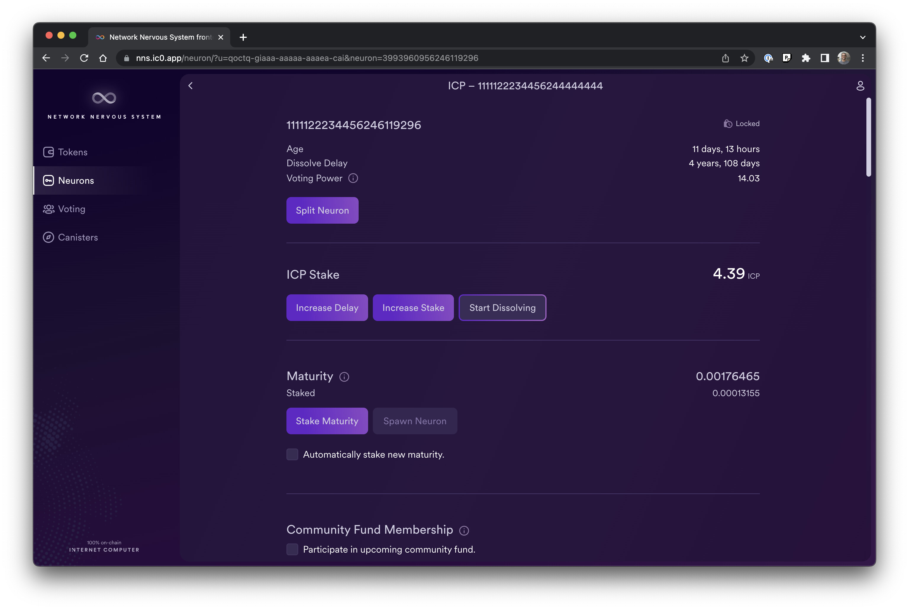
Less than a week ago (see post), NNS-dapp was upgraded to a shiny new design system. Its light and dark theme were fully revisited, all it’s components were adapted accordingly and a new layout and even menu were developed.

Today another step - actually multiple steps - were proposed to continue the design iterations towards a more stylish and user friendly dapp.

Following screens were reviewed to bring more readability and structure to the information and actions:

  1. List of accounts / tokens
  2. List of neurons
  3. Neuron detail

In following days & weeks we will continue our effort. Next on the agenda is notably the “List of transactions” view and other shiny ideas of our designers.


Public proposals

As you may be aware of, we made recently some changes in the navigation (see post) because we think that it would be useful - notably for newcomer - to provide more information about what’s NNS-dapp before they sign-in and because sharing direct link to the proposals would be handy.

The new version that has been unleashed by today’s proposal #93366 materialize this vision.

If you now open a link to a proposal in NNS-dapp, you shall land on its detail regardless if you are signed in or not.

This should help users accessing proposal content more easily.

Note however for this to fully workout like a charm it will still need a small release on the boundary nodes side to resolve the service worker even if a sub-path is accessed. Fix is on the way. (solved)


Hope you will like these improvements, let me know what you think, and stay tuned for more design iterations!


Screenshots


7 Likes

The penultimate update was perfect. this latest update on iphone ios is perceived as too redundant. My point of view & and the icons were much more intuitive than the ones in this last update.
when you click to see the information of the neuron. the next screen uses too much space and too much redundant information. You have to be clear and maximize space. to keep it neat, and minimalist and compact.
I repeat the penultimate update was brilliant. the only thing I would add from this latest update is the age of the neuron

If you allow me to share my personal point of view, I have to say that I personally really like this upgrade exactly because of the sense you describe. I feel like the information are not spread anywhere randomly anymore and it gets my focus way better but, again my two cents only. As I described in my above post it’s an on-going process with more iterations to come. I’ll forward your message to the team - including the designers - obviously.

1 Like

ok, but I think that at least once you click on the iD of the neuron you want to view on the next screen, it is not necessary for the neuron id to appear 2 times practically next to it. also the redundant id in the neuron description header is right next to the NNS log out icon, causing confusion.

Great addition for transparency!

Please add back the Manage Neuron topic. Please. Pretty Please?

1 Like

Yep, I am aware of it.

1 Like

Great to hear that, thx!

Just to avoid confusion, it’s a bug - i.e. something isn’t ok in the release - or it’s a request idea I’ll share with the team?

Hey @peterparker, et all,

This is sweet! As a novice techno user, here are some of the things I noticed:

  1. Login screen changed from “Fetching Delegation” (Not easily understandable for end-user) to “Finalizing Authentication” - Much better!
  2. Tabulated boxes that mimic sort of an windows-esque vibe (for nuerons). Still need to vibe with this UI a bit more - not sure If I liked the line item view more. Need to use the interface for another few days and will reply back. Interested in what the rest of the community thinks?

Truly appreciate Your/Dfinity’s persistent efforts to make the UI more user intuitive and cleaned-up. Considering where we were ~1 YR ago, sweeping improvements!

Well…I think it is a bug…There is no way for NNS neurons to use an important feature of liquid democracy, but I don’t think the team thinks it is a bug.:grimacing:

Oh I see, the one we discussed in https://forum.dfinity.org/t/the-goodwill-icp-distribution-framework. Indeed there seems to be some divergent opinion about it so unfortunatelly I cannot really help to move the situation. I’ve to also be honest you and admit that I don’t understand all the subtility of the discussion.

Hey David,

Wonderful job, as usual. The app is becoming terrific. Thank you for this.

To avoid the redundancy, we could erase the first displaying of the Neuron ID, and just put “neuron” (at the singular) a little like I did in the example above.

By doing this, the informations are being displayed logically :

  1. Neuron (We are exploring a neuron, in the neurons section)
  2. Above : ID of the neuron that we are exploring
  3. Above again : The other informations

Otherwise, the only sign of the fact that we are exploring a neuron is “neurons” on the left.

So, the “Neuron” apparition is a remembrance of what we are exploring, without implying the redundancy of the ID.

Thanks again @peterparker :pray:

1 Like

Thanks for the feedback @Roman, really happy to hear that :pray:.

Yep agree with you and aware of it. I was hesitant to remove it because it is handy when the page is scrolled, notably on mobile devices but since you and @esquivada mention it, it seems that it annoys the users so well noted!

2 Likes

Ho ! I understand now ! I admit that keeping it during the scroll is a very good point ! There is a real choice to do here, maybe by removing the second line rather than the first one.

Maybe we can keep things like they are. The scrolling is an important argument. Keep the first line seems necessary. So if we have to choose between keeping the both lines or remove the first rather than the second, let us keep the both lines.

1 Like

If that works for your, for sure that works for us :+1:.

Technically I can make the title dynamic by using an IntersectionObserver to detect when the neuron id (in the content) leave or enter the viewport. Not that overengineered (:wink:). The designer are still activelly improving the design, so I should also check that I would not implement such as thing that ultimately would not be used anymore.

I’ll discuss with my colleagues designer and UX experts.

2 Likes

Perfect set up I think. But, yes, It will depend on the designers work too.
Thanks again !

1 Like

@Roman @esquivada there you go (PR #1573)

gif

3 Likes

:star_struck::heart_eyes:. It is WONDERFUL ! So clear and elegant. Just perfect.

Thank you so much for your incredible work David :pray:

5 Likes

Happy to hear that! Thank you for the feedback and brainstorming Roman :+1:

3 Likes

And thank you for always genuinely considering the community’s opinions. It is invaluable and unique.

2 Likes

Super, very nice job :ok_hand:

1 Like