Thank you for this. I remember the first version of the NNS UI, with its - if I may say so terrible - color scheme. We are moving into the right direction
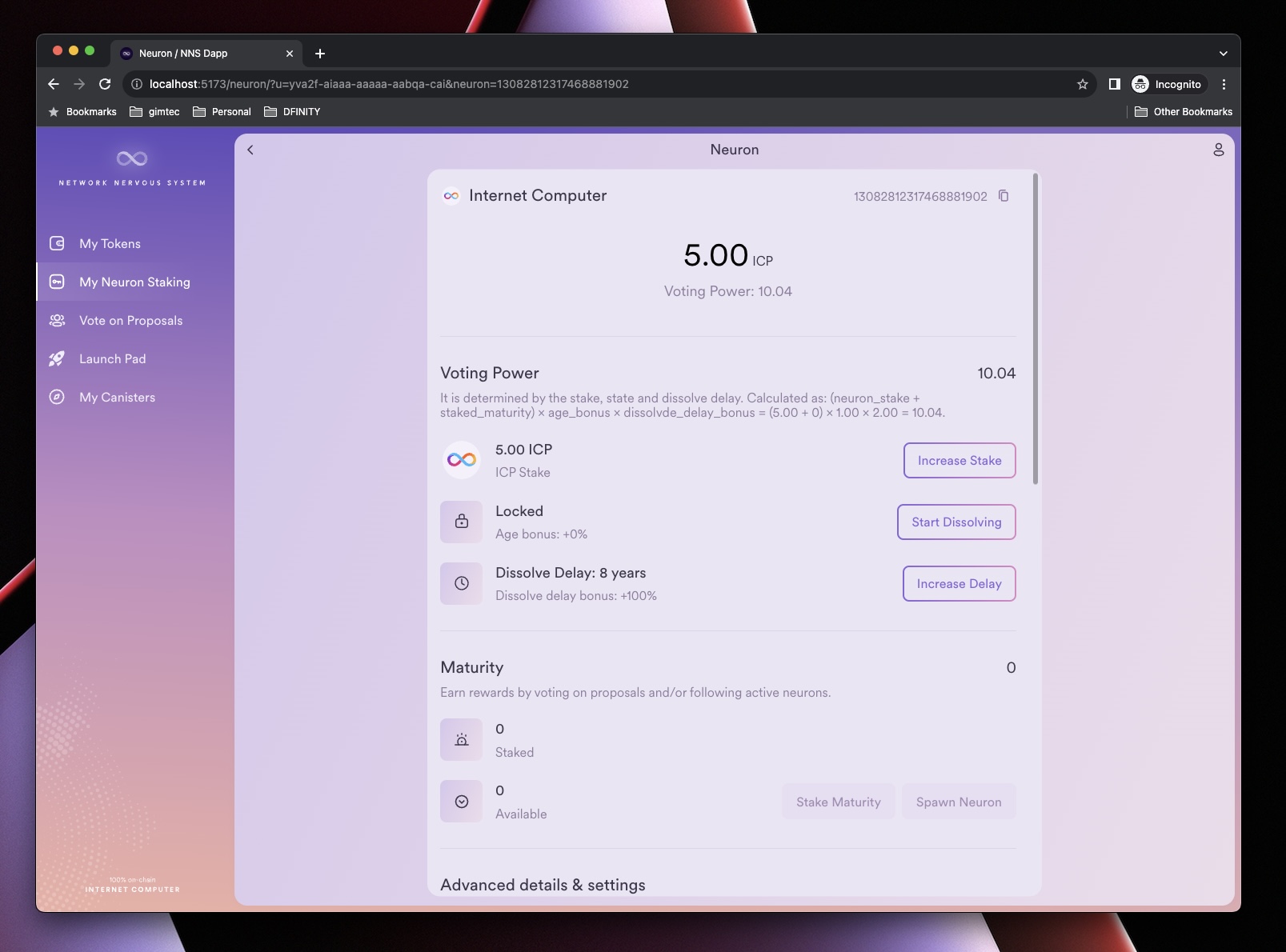
I think this rather long description “It is determined by the stake, state and dissolve delay. Calculated as: (neuron_stake + staked_maturity) × age_bonus × dissolvde_delay_bonus = (0.00 + 0.00) × 0.00 × 0.00 = 0.00.” could be visible after clicking the icon (i) and not immediately after opening details of the neuron. In addition, it would be good if rounding all values to 2 decimal places in the UI was only optional.
But still I appreciate it, very nice job done by the designer!